Unisex Names Dashboard

Domain Introduction

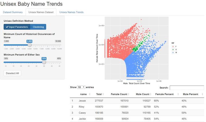
Gender and naming convention are constantly shifting, from names shifting gender connotation, to the rise of unconventional names in recent years. However, Unisex name and their usage have shifted from being known as names for a certain gender to the other over time, or having a even split of gender usage. This study focused on identify unisex name and the prevalence of those names in the US populace. The analysis was focused on the US Baby Names dataset issued by the Social Security Administration which contains data collected names of babies born in the US from 1880 to 2013. R was used to analyze and visualize the data. The output of this study is an interactive Shiny App that can be used as a research tool in social science that reflects changing attitudes towards genders in the US.

Dataset

The dataset consisted of five columns; year, sex, name, n and prop. The contents of the columns are: Year has numeric values that span from 1880 to 2013, Sex has a character data type and has two possible values, male and female, Name also has character data type and consists of all unique names recorded in the time frame, n shows the number of people holding a certain name and prop shows the percentage of newborns having a certain name from each sex. Dashboard Unisex Names Dataset Tab Inputs

Design

Unisex Name Definition

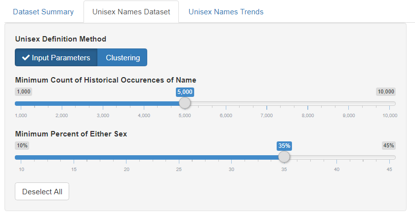
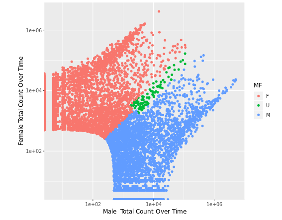
Dashboard Unisex Names Dataset Tab Inputs An important part of the analysis was to give a clear definition of unisex names. The benefit of relying on an interactive dashboard is that it enables the user to manipulate this definition in several key ways. The user is presented two methodologies of identifying unisex names. In the first, the user is able to select the minimum usage of that name over time as well as the minimum percantage of either gender. Conceptually this allows the user to choose names that are more or less common and are more or less balanced. In the second, K Means clustering analysis is applied to the dataset based on the scaled log of count of male and female over time. The user is able to select the number of clusters. The plot automatically marks clusters as male, female, or unisex based on their mean composition. Dashboard Unisex Names Dataset Tab Plot

Popularity Metric

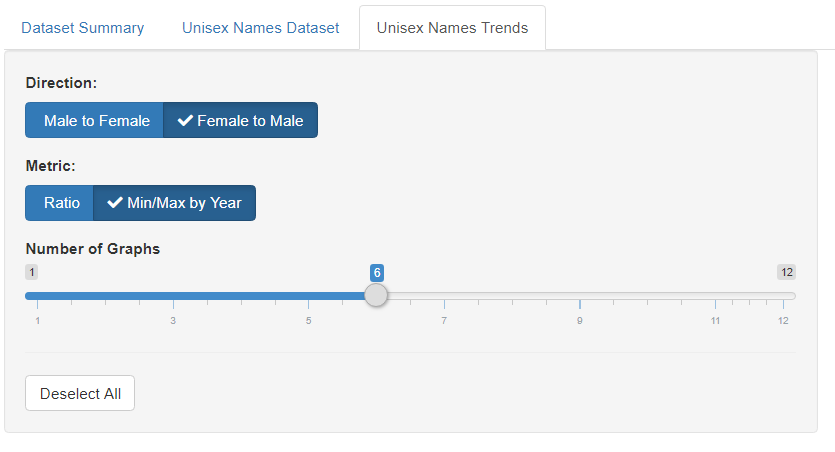
Dashboard Unisex Names Trends Tab Inputs The third tab allows the user to dive deeper into the usage of specific names. The visualizations are designed to focus on the trends and shifting usage of names given two metrics of popularity. The first relies on the mean between sexes in a given year. A historical mean (based on the median of the dataset) and a current mean is calculated and the metric is the ratio between these means. The second is the is based on the relative difference between sexes at the maximum year of each. This maximizes the Male/Female ratio at time of highest popularity for that sex in that year

Dashboard Unisex Names Trends Tab Plot

Users can select either metric and direction as well as the top N names for that combination. They can also select any set of names (up to 12) to compare from the dataset table. Dashboard Unisex Names Trends Tab Plot

Artificial Intelligence Consultant,

My focus is on full-stack deployments of AI with end-to-end project development

Related